6 Keys That Separate Good and Great Apps
As the app world becomes more and more populated, we see more and more apps fly across our devices. There’s some really cool ones out there. There’s some beautiful interfaces, intuitive controls, and snazzy animations. The average app quality has definitely improved as of late, though the App Store itself will always be a sea that’s way to easy to get lost in.
And most of the apps you download land in this “average” category. They do what they say, they work, they’re ok. But then… then there’s apps that stand out. Apps that are fun and easy to use, apps that fit into your workflow, apps that win design awards and apps that push the mobile thinking.
Mobile-first is becoming a standard, though not every company or organization has the resources to instantly make that pivot and dig into some R&D and testing. Interface design, user testing, and UX planning; those usually don’t fit into a super-lean budget. So, which pieces are worth it? Keep reading. Have a friend or colleague involved in tech, mobile, or startups? Send them this article.
1. User Experience
Good apps have design… great apps have user experience.
Design in general has massively improved since the old days. There’s tons of beautiful apps out there. Especially with iOS 7 and flat design, even basic, non-skinned, plain interfaces look good (and that’s the goal of flat). So, now that the average has thankfully become palatable, what can make it great?
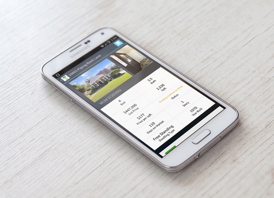
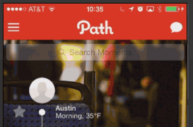
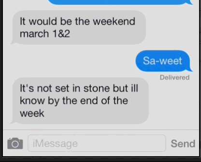
It’s in the details, the “small” stuff, which turns out to be not so small. It’s the little pieces that help your users consume and digest content. Those that enhance our experience. Small devices and mobile real estate is precious. Going from desktop to mobile, our content often loses a degree of fidelity, there’s just no room for it. We may lose context, time stamps, and other meta-data. But great apps find intuitive ways to preserve that information. I love Path’s scrolling time indicator, and iMessage’s time stamps.
Other small stuff, subtle indicators that help your users navigate your app. Notification badges, loading indicators, progress markers. Highlight new content, and insert something relevant if there’s nothing there. We’ve all watched people sit there and refresh their Facebook feed 10 times in a row. But even worse is when users miss messages or updates. Also bad is when you pass over free marketing and advertising opportunities.
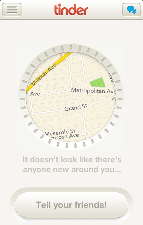
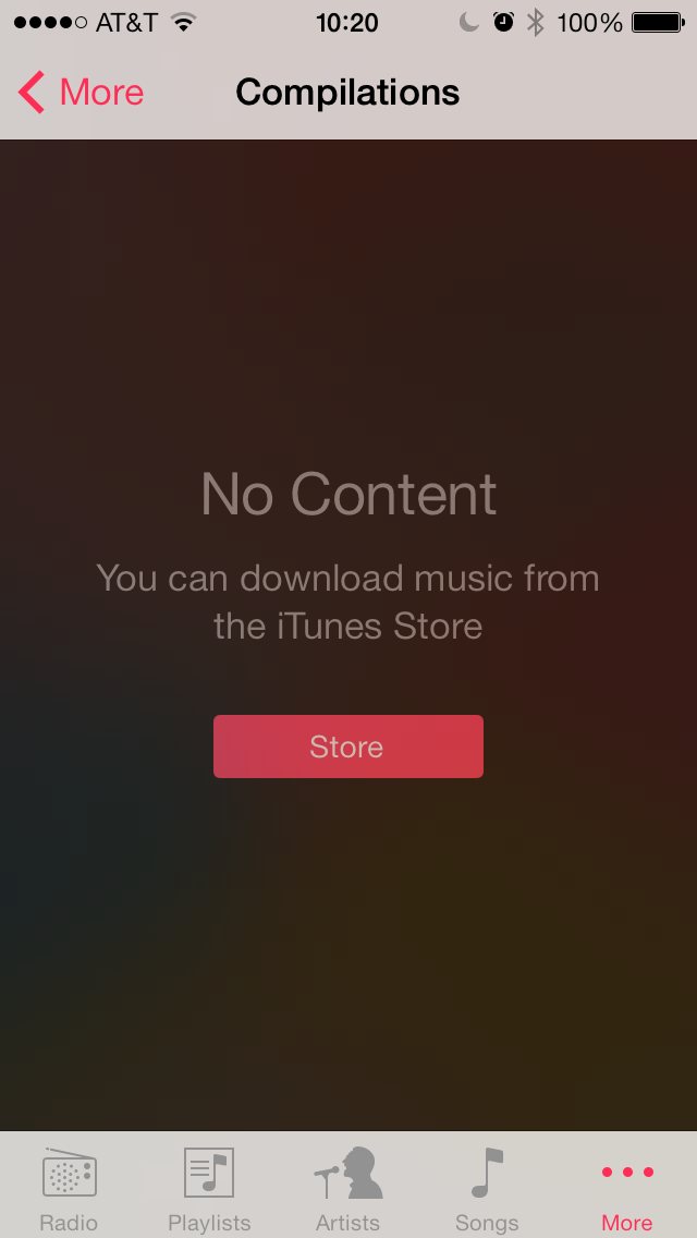
When you run out of matches on Tinder, you have the option to invite more people. While I don’t suggest spamming your friends through dating platforms, it illustrates the idea: when users consume all of the content, give them ways to find more content. Any of Apple’s media apps, if you don’t have media on your device then they display a link to iTunes. Mobile real estate is too valuable; never display blank screens.
What we don’t expect are the little things. The cute little key clicks of Letterpress. The loading headers of Snapchat or Yelp. Internet and connection speeds are pretty good these days, but including these animations serve to occupy users during those remaining micro-moments of wait time. And they’re a nice touch. Having your users say “oh that’s a cool” is much, much more desirable than “c’mon load already”.
2. Instant user feedback
Good apps are functional… great apps explain those functions.
Ever see the loading spinner flash in your status bar, but not sure what your app is doing? “Gosh, I never know what she’s doing back there… what is she doing?!? MA, THE MEATLOAF!”
When you’re downloading content, processing information, or any other magic behind the scenes, you have to tell the user something. You either need to let them know what’s happening or how long they’ll be waiting.
3. Caching
Good apps have short load times… great apps have no load times.
The downside of the web, is that every page you visit has to load fresh (mostly). Even if you’re clicking back to the homepage, you’re still re-downloading content. What if you’re connection drops halfway through, or you step onto that subway ride. Well, then your data is dead. The upside of native mobile apps is that they can function offline.
Caching makes us more both efficient online, and allows us to do more offline. For example, if Google Maps didn’t cache, I would get lost on each NYC subway ride. If Twitter didn’t cache, I would lose my reading place every time I opened the app.
Ever use an app that refreshes your messages every time you click that tab? It feels like being back on a website. “Really… I clicked on my profile and then back to my messages, why do I have to wait again?” Now consider first-time users that are just clicking around your app, those refresh wait times add up.
4. Syncing
Good apps downloads content when I request it… great apps have it ready before I get there.
Now, the really cool stuff is when our data updates for us automatically. And I’m not talking about the annoying iTunes iPhone sync. I’m talking about transferring recent activity and user information between platforms; sharing and pre-populating content.
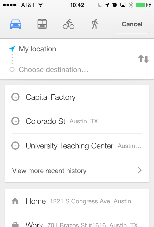
Google Maps has obviously dethroned Apple’s own mapping app on Apple’s own platform. My favorite feature: syncing destinations from desktop to mobile. If I Google directions when I schedule a meeting, they’ll already be on my phone when I hop in the car. That’s awesome.
Apple’s Reminders app: when I add an item while working on my Mac, it’ll ping me on my iPhone later that day. I haven’t forgotten the milk in a while.
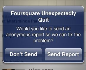
5. Crash Reporting
Good apps rarely crash… great apps identify and eliminate crashes.
This is part of the app that most people never get to see, but from behind the scenes, it’s invaluable. This feedback from your users is how you improve an app from good to great.
Crash reporting sends back reports when the software malfunctions. This may be a bug, or a new use case that needs to be handled. Users may be uploaded unexpected file types or are trying to search different locations. If we’re seeing the same crash reports repeatedly, we know it’s time to investigate.
Apps and smartphones have plenty of edge cases. Did you test while offline, while running in the background, while recording audio? Did you simulate memory warnings, did you simulate receiving a phone call? Did you review all of the screen sizes, how about different aspect ratios? What if the app is activated from that push notification? We have thorough edge case test plans, but crash reporting helps you pinpoint cases you may not have even considered.
Our favorite is Crashlytics.
6. Analytics
A good app performs user testing… a great app is always performing user testing.
And then looking forward, everyone loves analytics these days, and mobile is no exception. User testing on a limited budget is difficult; analytics give you insight into your entire user base.
Do you have a website without Google Analytics? What are you doing?! There’s a mobile flavor now too, Google Mobile Analytics with integrations for iOS and Android.
We use Google Analytics on every web product, now we can seamlessly include mobile metrics into our reporting. It’s awesome. Are users getting lost in your app? Are they spending too much time looking through lists of options? Do they make it to the new post screen, but close out when it asks them for their location? Which features are the most used, and which pages are the most visited?
Great Examples
If the tools and services I use everyday don’t have a solid mobile app, I find a new service. Project management, task lists, email, maps, music, travel, etc.
Delta. Travel is a pretty saturated market. But great travel apps are pretty much nonexistent. Delta updated their app, and in my way-to-jet-set-life many times I’ve easily changed my seat, chosen a different flight, checked my miles, and confirmed my seat upgrades. I’ve done this from the office, on the way to the airport, and even while waiting in the terminal. Because c’mon, no one wants the middle seat.
Google Maps (from above) has obviously dethroned Apple’s own mapping app on Apple’s own platform. My favorite feature: syncing destinations from desktop to mobile. If I Google directions when I schedule a meeting, they’ll already be on my phone when I hop in the car. That’s awesome.
Basecamp let’s me do everything in the app that I can do from the web browser. If I’m testing on my iPhone and taking screenshots, I can directly upload and attach those screenshots to Discussion and To-Do items in my projects. That saves me from sending an email, or importing my images.
Spotify wasn’t the first-to-market, not by a long-shot. But their platform is awesome, and their mobile app is great. I can seamlessly go from desktop to mobile, listening to the same song or playlist. That’s why I use it over other platforms.