
How to Design a Mobile App from the User's Perspective
Flurry released data from their tracking of more than 300,000 apps and found that the average time spent per day on mobile devices is two hours, thirty-eight minutes, of which 80% of mobile device time is spent in apps while 20% in browser.
It is not exaggerated to say that mobile apps are not only products of modern information technology, but more like a lifestyle that you choose to go with. Because of the crucial role that mobile apps play, we as designers should shoulder the responsibility to design the apps from users’ perspective and for users’ convenience. So we’ve summarized some points about designing apps from the user’s perspective for you to incorporate into your app flow.
Five Tips for Designing from the User’s Perspective
1. Pay Attention to User Operation Habits
A good app is not all about clean and beautiful UI design; it’s also about considering what operation habits will be most comfortable for users. If most users prefer one-handed mode over two-handed mode when using big smartphones, then do they prefer to use left hand or right hand to operate? Thinking about all these issues can help you avoid touch blind points in your app, and lead to better layouting of the interface and response buttons. For instance, if you are designing an app that needs high-density information input, like a handwriting app, digital notebook app, sketch app, etc., think about adding a new setting option to allow users to toggle between left-handed mode and right-handed mode.
2. Consider the App’s Usage Environment
Every mobile app has its own target user group that determines the app’s main usage environment. If users mostly use an app in noisy environments, like waiting for the bus or shopping in a mall, then you should design the app to overcome the environment issue by not integrating any voice input features since the noisy environment will increase the deviation. Or if you envision your app will be frequently used in a crowded space, reducing high volume of keyboard inputs by providing pre-populated values or auto-completing inputs could be a good solution.We worked with Capital Factory, a local startup incubator, to craft a mobile app to help people browse event host info and check out tweet updates for the SXSW kick-off party, ATX Startup Crawl. The party started at 6pm and always lasted until midnight. By having that core scenario in mind, we decided to use a dark color scheme in the app’s design to offer users a better reading experience in dark environments.

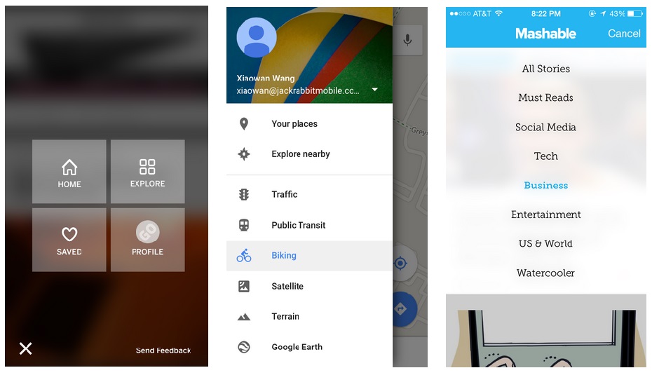
3. Flat Navigation Pattern Is Encouraged
“Narrow and deep” or “broad and shallow” navigation patterns could always bring up heated discussion around website design, but a noticeable preference toward “broad and shallow” navigation is shown in mobile app design. The smaller mobile device screens make navigation harder and trickier than on a laptop, and it’s easier for users to hit the wrong navigation button unintentionally, requiring them to use the back button and start over again. Having a more shallow navigation structure in this situation makes it harder for users to get lost or lose patience, since there would only be one or two steps away from wherever they need to go. Popup menu, drop-down list and sidebar menu are all good choices to build flat navigation structure.
4. Core Feature Comes First
By tracking and observing the user interaction through analytic tools and conducting user tests, we found out roughly 20% of app features could result in 80% of actions or user engagement. So when you layout app elements, make sure the 20% core features are easily accessible, navigation-friendly and occupying the most important real estate in the screen. However, applying the 80/20 rule doesn’t mean completely ignoring the 80% of features, which may influence or attract the 20% users. A wise approach to handle that could be to hide them in a deeper level of the navigation structure and carefully guide users there when necessary.
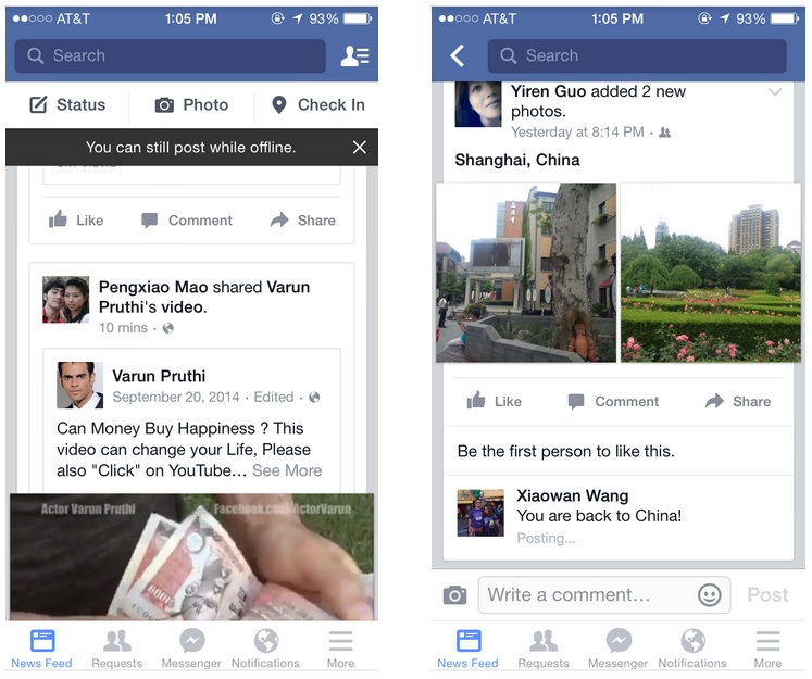
5. Autosave Content When Unexpectedly Getting Offline
Facing internet connectivity issues is a disaster for smartphone dependents. Showing an alert banner and quitting the window after users compose a long message is not user-friendly. Users then have to waste their time to re-enter the message, which annoy them and cause them to abandon the product. Facebook does a good job of helping users overcome internet issues by autosaving messages when offline, and sending the saved messages once the internet is back.
 Older posts