
Best Mobile App Design Guide, From Jackrabbit Mobile
Our technology consulting firm has outlined the ideal process to creating the perfect mobile app.
Typical Mobile App Design Projects
- Product Strategy Sprints
- Updating an outdated interface to modern standards, such as flat or material design.
- Testing business assumptions or designs with a user session
- Translating an interface from iOS to Android
- Crafting the user onboarding experience
- Performing a competitive analysis
- Wireframes and mockups
Usability Design
Usability is an attribute that determines a product’s ease of use. It is defined by five quality components as explained by Jakob Nielson :
- Learnability: How easy is it for users to accomplish basic tasks the first time they encounter the design?
- Efficiency: Once users have learned the design, how quickly can they perform tasks?
- Memorability: When users return to the design after a period of not using it, how easily can they reestablish proficiency?
- Errors: How many errors do users make, how severe are these errors, and how easily can they recover from the errors?
- Satisfaction: How pleasant is it to use the design
Although usability affects the user experience, they are not the same thing. User experience is about emotional connections to a product while usability is about removing roadblocks in order to make a product intuitive and easy to use. This is important because when users encounter a difficulty in your website or app, they tend to leave and possibly find an alternative to your product and service. On average, it’s been found that if you spend 10% of your product’s budget on usability, the desired quality metrics tend to double. This includes conversion rates, traffic numbers, user performance, and target feature usage.
So how do you improve usability? At Jackrabbit, we find that the most useful method is user testing. This involves bringing in representative users, asking them to execute certain product based tasks with your design, and observing their successes and failures with the user interface. Letting them think aloud while performing these tasks is crucial to getting productive feedback. For a more in depth look at how we conduct these tests, read our user testing section.
It is recommended that you focus on usability through every step of the design process. Start with low fidelity prototypes and keep iterating after each group of testing. Don’t put off user testing until you have a finished and fully implemented design. Doing so will limit how many usability problems you can fix before launch so start as early as you can. In fact, testing a competitor’s product before you begin designing can prove to be beneficial as it will help you understand what other products do right or wrong. This will prevent you from making any of the mistakes that competitors have made, resulting in saved time and money.
User Research
User research has two parts: gathering data, and synthesizing that data in order to improve usability. The data being collected varies from each project and can include something as simple as “is this button’s action clear to the users”, to more complicated as “does this features entire flow make sense to the user”. At the start of the project, design research is focused on learning about project requirements from stakeholders, and learning about the needs and goals of the end users.
We do user research because we care about not only creating apps that are visually stunning, but that are also functional and appropriately meet all of the users’ needs. Building an app is just the beginning, but in order for it to be 100% successful you actually have to test what you made and validate its features. Research is needed to analyze where your users are having difficulties and uncover new opportunities for features and conversions. This helps to ensure that we have created a product that users are actually going to want to use and that we have it designed in a way that makes them want to use it. Ultimately, doing research will save your organization valuable time and money. It removes assumptions and allows for mistakes to be caught early on. The later you discover that your assumptions are wrong, the more money it will cost you to fix it.
User Testing
Our user testing process consists of 6 steps:
1. Planning what we’re going to test, during which we are trying to:
Define the Target Audience which are the assumed potential users and our key demographic.
Define Key Points or main use flows for us to test, by:
- Collecting issues and presenting them as goals
- Prioritizing the goals
- Rewriting the goals as user-specific questions to be answered or information to be gathered
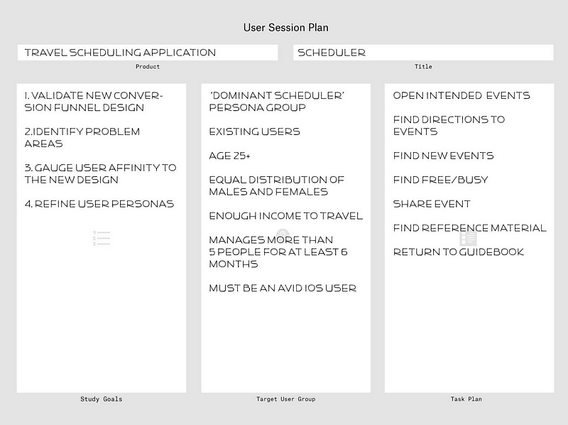
2. Recruiting individuals to come and participate in the study through various ways:
Craigslist Ad when our target audience is broad enough that we can pull participants from the general public, we post an ad on Craigslist that contains a survey to be completed. The surveycontains a few open ended questions that are geared towards what we are testing.
Social Media, Google, and Lists of Pre-Qualified Users are used when the target audience is much more specific and pulling from the general public wouldn’t provide the necessary results.
3. Screening Participants for the study based on the results from the survey.
The goal during the screening process is to select 5 individuals who best fit the study’s needs. The reasoning behind selecting only 5 is that it has been shown that feedback from 5 individuals will provide a range of answers that are still narrow enough for commonalities to be found, as well as being time sensitive. For more information, visit here.
4. Scheduling User Sessions
User sessions are usually scheduled to all be conducted in a day and typically last 30 minutes each. Client participation is highly recommended. It cuts back on any disconnect during the presentation of findings and it keeps everyone in the loop of what is going on and what is being said by potential users.
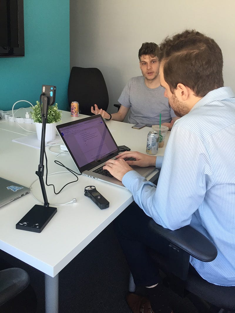
5. Running a User Session and performing the interview has numerous components to it:
The agenda may vary depending on what is being tested during, but generally consists of introduction and getting to know our participant. Then we ask a series of questions which reflect our key points and typically have the participant interact with a prototype of what we are testing.
We’ll likely record either a video, audio, or screen recording of the interview so that we can focus on performing the interview and have the data to review afterwards.
We have a Non Disclosure Agreement (NDA) to ensure that whatever is discussed during the session will be kept confidential. We write a script in advance and it contains a series of open ended questions that were curated by the team to address the key points established during the planning phase.
Our typical roles are Moderator, Transcriber and Observer/Equipment facilitator. The moderator is in charge of conducting the interview by asking all of the questions and will be the main person engaging with the user. The transcriber isin charge of recording all of the user’s answers during the session. And the Observer/Equipment Facilitator ensure equipment is set up and running correctly and observing quietly during the session.
“Hallway” Testing is an alternative option to having in-office user sessions that bypasses recruiting and scheduling appointments with users. Typically these forms of user sessions take place out in the field at public places like coffee shops, libraries, campuses, etc.
6. Analyzing Data and Presenting Findings through various approaches:
Lean Analysis the team will briefly discuss and break down the key points that came up while testing (new opportunities, unexpected pains, confirmed predictions, etc.).
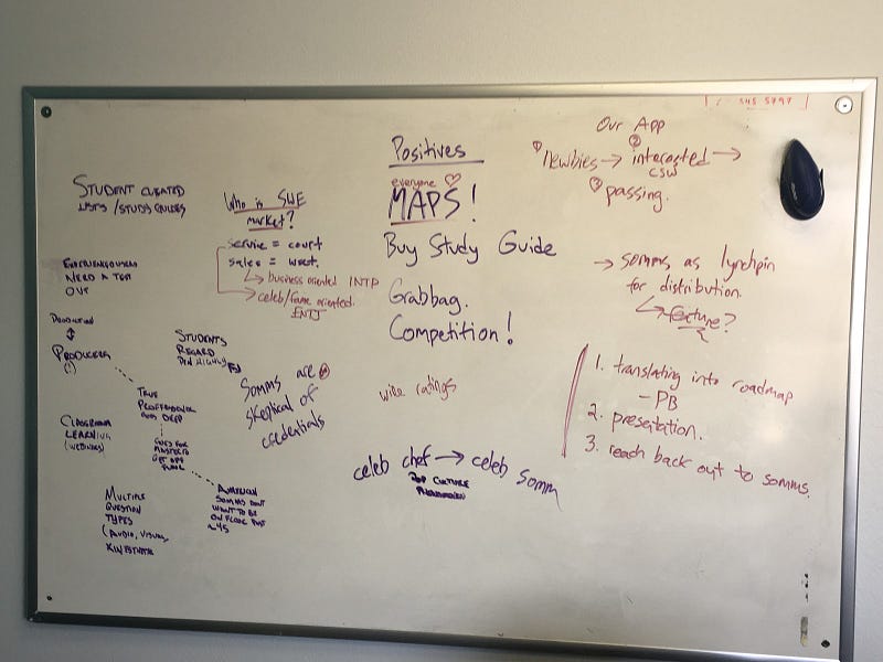
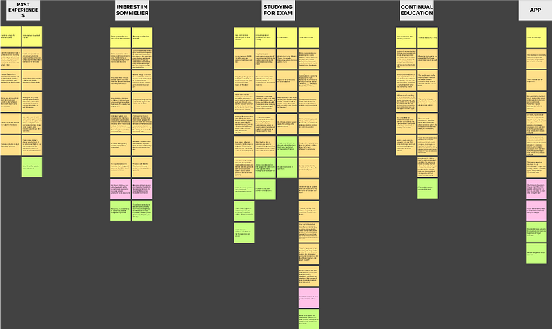
Data Analysis the quotes gathered during the interviews are broken down and coded according to specific points:
- Doing — behaviors and actions performed
- Feeling — emotional reactions and attitudes
- Thinking -describes the mindset and considerations/thoughts
- Pain — decision points with negative outcomes or hindrances for product
- Opportunity — decision points with positive outcomes or possibilities for product
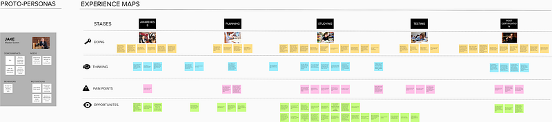
Experience Map using mural.ly, this involves taking the breakdown from the data analysis and grouping together quotes that fit within a similar theme to form a potential user flow.
Journey Map is used to present the findings through a narrative story of a persona created to reflect a potential user and their journey based on the data collected from the testings.
Prototyping
Prototyping is a valuable tool we use to help communicate and test ideas. One of the benefits of testing with prototypes is that users can be more engaged when talking about the concept we are testing. As the value proposition is further understood through the design process, we are able to refine prototypes through fast iterations in order to avoid developing the wrong solutions early on. Learning from failures can be a valuable thing, but failing on a large scale can ultimately result in the death of your product. Prototyping enables us to learn at earlier stages to prevent large scale failure, ensuring that we build the best product from the get go.
A prototype is any simulation of the final product. It is important to keep in mind that a prototype will not always be high fidelity or look like the final product. It may be a series of paper sketches, a click-through of a series of mockups, or in some cases even a physical artifact.
Paper
Paper prototyping is a quick and easy method to test your initial ideas. It involves sketching your product with a pencil on paper. These sketches may display various screen states. Paper prototyping allows you to iterate at a fast rate. Based on users’ feedback and expectations, you can erase and make changes accordingly during the testing process. Paper prototyping is the most flexible way of testing ideas quickly but there is a downside. It is not as immersive as other prototypes, leaving a lot up to the users’ imaginations.
Click-through
Click-through prototypes are our favorite artifacts to test with. These are usually a series of static screens linked together with clickable hotspots. These are more immersive and closer to the final product than paper prototypes. Our favorite workflow for creating these involves designing mockups for each screen and/or screen state in sketch, exporting those, and uploading them to marvelapp.
Physical Artifact
Certain projects can sometimes call for using different methods of prototyping. Sometimes we design products that aren’t exclusive to a digital medium and we need to test how an app may affect a physical object or vice versa.
Mobile App Design Guide for Visual Aspects
Visual design is the strategic use of imagery, color, shapes, typography, and form to improve user engagement and brand trust. Successful visual design isn’t just about making things look pretty, it’s about communicating the purpose of the product and the utility of its interface. Visual design plays an important role in boosting user confidence and satisfaction by helping them get their jobs done quickly. For example, if an interface is over styled, a lot of important information and CTA’s can become obscured. The most important aspects of visual design are those that help a user quickly scan information, take the correct actions, and know where they are in the product.
For a quick crash course on some basic visual design principles check these out:
- http://learndesignprinciples.com/index.html
- https://www.smashingmagazine.com/2014/03/design-principles-visual-perception-and-the-principles-of-gestalt/
Visual design is also about first impressions. The tone of what the product is and represents in the eyes of a user should be informed by user and market research. Once you have more insight into who your target users are, moodboards can be an effective tool of honing in on a visual design language. A moodboard is a collection of visual inspirations that you think are effective in communicating similar tones and themes that you are trying to. This compilation of visuals can help spark discussions on how other designers have both succeeded and failed in communicating similar themes.