What We’ve Found: User Onboarding Best Practices
The past month I’ve focused almost entirely on good practice for onboarding users. There are a few great tools out there for learning about best practice, but I found it tough to find much that compares and dissects each step of the process. That’s what I’ll attempt to do here.
The majority of apps follow the same basic login process. It’s some variation on this:
- Tutorial
- Log In or Sign Up
- Email Confirmation
- Ask for Permissions
- Start Using the App
Now there isn’t anything necessarily wrong with this flow, but upon further examination it becomes clear how many apps out there have come up with crafty, better ways to onboard their users. Let’s explore a few of those apps.
Tutorials
Let’s start with the tutorial. Ideally your interface is intuitive enough not to need a tutorial, but the tutorial is becoming more and more of an onboarding staple. The important thing here is to only explain the aspects of your app that you don’t think your user would be able to infer from the interface itself.
Most apps do tutorials in the beginning, before the user gets a chance to play with the app on their own. Everyone knows the actual app is waiting for them behind the tutorial… so why not let them explore the app along with your tutorial?
A Better Way to Do Tutorials
One great example of an interactive tutorial is Paper by Facebook:
Paper uses voice, text instructions, as well as a moving dot gesture to communicate how users can view stories in the app. Once a user swipes up on the card at the bottom, the app gives them a nice completion screen complete with check mark and video game-like sound effect.
Another good way to walk users through your app in real-time is by highlighting certain modules on the screen and explaining their functionality.
Both of these are more likely to actually engage new users, as opposed to the static tutorial screens so many apps employ that just end up getting skipped.
Login / Sign Up
The best login flow is undoubtedly no login at all. So first ask yourself that question: Do we really need users to log in?
We’ve seen time and time again huge drop offs when comparing app downloads to actual logged in users. Making this process as simple and convincing as possible could do wonders for the amount of new people using your app. If you work with a copywriter, this is a good point to bring him/her in.
On teams I’ve worked with in the past, quite a bit of deliberation has gone into this one simple screen. What are the upsides to using Facebook login? Do we want to let users create accounts with their email addresses? Do we want to give users the option to skip logging in entirely?
How you decide to position your login screen relies a lot on what you’re trying to do with your app. Is it a supplement to an already existing web app? Will most users come to the mobile app already having an account, or will they need to create one?
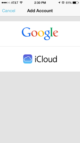
Facebook is an example of an app that assumes most of its users already have accounts, and decides to minimize the sign up option:
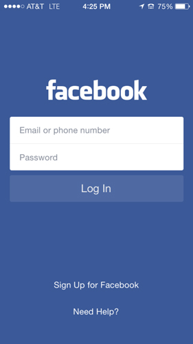
It’s clear that what Facebook wants users to do is to enter their email/phone number and log in.
Yelp, on the other hand, takes a different approach. The primary call to action here is “Get Started”:
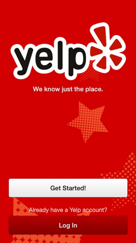
This is a bit of a strange choice, as the “Get Started” copy implies that on the next screen I’ll be already using the app. Instead, after tapping “Get Started” I’m greeted with this screen:
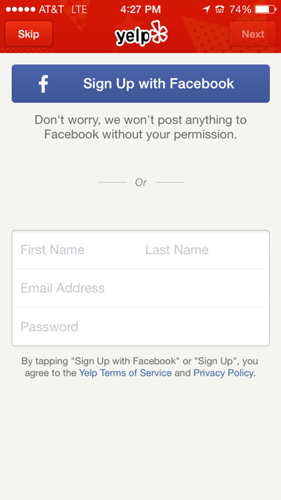
I guess “Get Started” actually meant something like “Sign Up.” It’s still possible for users to skip this screen and actually get started, but it’s strangely hidden in the top left, in a color that blends in with the header. The weird part here is if the user skips login, they still get to use the primary functionality of Yelp – to search for good places to eat nearby.
It doesn’t allow actions like bookmarking the page or syncing, but I have to think that Yelp could have done away with the login/sign up screens entirely and introduced them at a later point where users would see more of an obvious benefit.
A Better Way to Do Login / Sign Up
One app that kills here is Mailbox. Upon opening the app, Mailbox presents a simple tagline and two options: Add Account, or Sign In with Dropbox.
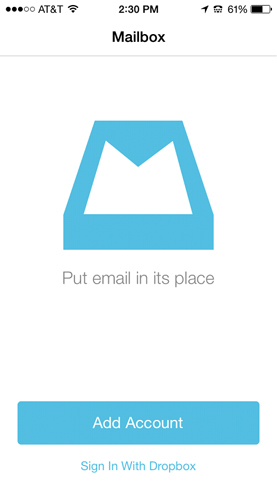
Mailbox also makes it obvious which of these two options is the preferred option (Add Account), lessening decision fatigue.
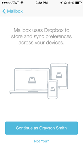
If the user decides to sign in with Dropbox, the app presents the value of syncing with a Dropbox account and a confirmation that they’ve picked the correct account. The wording of the button “Continue as Grayson Smith” is particularly good. It doesn’t signify the onboarding is finished, as something like “Get Started” would, but still shows progress.
One improvement here could be to let the user know how many more steps there are before they can actually use the app.
Forgot Password
You know your users are going to forget their usernames and passwords. It’s something that every app with a login handles in some way or another, and a focus on the user experience is often swept under the rug.
A Better Way to Handle Forgotten Passwords
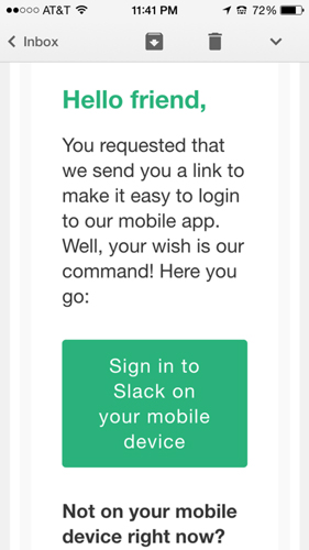
One app that really holds the user’s hand throughout the whole process is Slack. Instead of using the standard “Forgot Password” button that links to a web view, Slack provides the option to receive a sign in link via email.
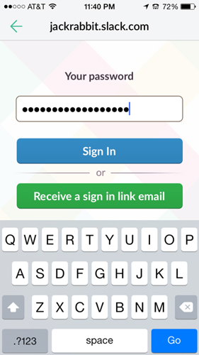
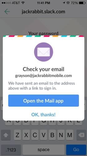
After the user taps to receive a link through email, Slack prompts a dialog where it will even open the Mail app on the iPhone so users don’t have to navigate through their apps and have the potential to get distracted or forget what they were planning to do with Slack.
The sign in email includes a large button that is easy to tap. One tap later, they’re inside their Slack app.
No clunky password recovery or reset. Instead, just straight to the point. The user doesn’t care about resetting their password. After all, they’re probably going to forget it again if they do.
Permissions
If used right, push notifications are one of your most valuable tools for re-engaging your users. The problem is the vast majority of apps prompt the user to give permission to send push notifications right after downloading the app, sometimes even before logging in.
An important part of getting the user’s trust to enable push notifications is to wait as late as possible to ask for the permission. The more clear you can make it to your user how you’re going to be using push notifications and how it will benefit them to have them turned on, the higher your opt-in rate is going to be.
A Better Way to Ask for Permissions
One smart way to do this is called permission priming. Basically all this means is asking a question to let your user know why you need push permissions. Here is a simple but effective way Yahoo Finance does it:
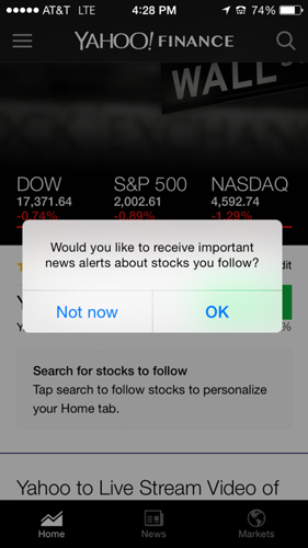
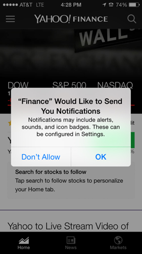
If the user presses “Not now,” the second alert view will never be shown (likely Yahoo delays it to a later session, or waits for a certain user action to re-prompt). By getting your user’s informal commitment with the first AlertView, you can assume your users will be consistent and tap “OK” on the real permissions prompt.
Once your user decides to not allow push notifications, it’s pretty much certain that they’re not going to go and turn them back on. In order to turn them on, the user would need to leave your app, open Settings, find your app in the convoluted Apple Settings menu, and re-enable push notifications. That’s not gonna happen. So do it right the first time.
Check back in a few weeks and I’ll be doing a full deep dive into the different ways we’ve handled permissions in our own projects at Jackrabbit, as well as dive into our data and conversion rates.
Feel free to tweet the team @teamjackrabbit or comment below and join in the discussion about onboarding users.