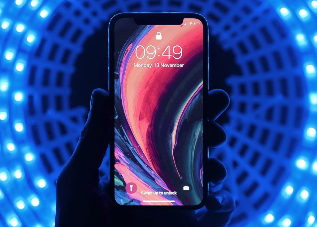
iPhone App Design: 11 Tips You Need to Know
You’ve done it. You’ve thought of a killer app idea for iOS, and now you’ve got to get it ready for the App Store. However, the iPhone app design has evolved significantly over the past few years as Apple continues to provide users with new features on every update to their operating system.
For starters, your app has to work on a range of iPhone models. But for it to be adored by users, you have to utilize the retina display to its full potential, include FaceID as an option to log in to apps, and incorporate gestures instead of pushing buttons.
But that’s just the tip of the iceberg. There are several other design and functionality aspects you need to consider when you’re creating your app. If you want your iPhone app to become a viral sensation, then you should follow these expert tips so that you get your design right.
1. Use Adaptive Design for Different Model iPhones
There was a moment in time when phone screens were getting smaller and smaller. But these days, they seem to be getting larger, which you’ll need to take into consideration when you’re designing an app for an iPhone device.
If you utilize tools such as Xcode or Sketch Constraints, you’ll be able to produce a design that will fit on everything from an iPhone 6 to an 11. It can event display extra menus if they’re required.
It’s much better to expand the user interface so that the app seems native to the device. Scaling up the size according to the device can produce visual and functional complications.
2. Don’t Forget the Rounded Edges
Apple made the switch to rounded edges and added a scallop shape to incorporate the front camera and speaker. Some designers have put a black bar at the top and bottom of the screen to get around the design. But Apple prefers that you utilize the full space to give users a more immersive experience.
3. Pay Attention to the Aspect Ratio
The tall display of the iPhone can stretch full-screen images, letterbox it on the sides, and cut key details from the top and bottom. This can have significant impacts on important information that you display in these locations. So keep in mind the aspect ratio, especially if you’re designing specifically for an iPhone X or higher.
4. Don’t Hide the Home Key Indicator
Most iPhone users are now used to the lack of a physical home key indicator. Unfortunately, some iPhone apps haven’t chosen to hide the button and force the user to make it reappear. But Apple prefers that you don’t use this option.
You should try to avoid placing any buttons close to the home button. It can interfere with the user experience and confuse anyone trying to navigate your app.
5. Offer FaceID for Authentication
Touch ID no longer exists on newer model iPhones. Instead, users unlock their phones with their faces. If you’re planning on any lock/unlock systems for your app, then you should reference Face ID and not Touch ID.
6. Factor in Custom Keyboards
Apple makes it easy for designers to cater to custom keyboards. Users who have these installed will automatically have emoji and dictation features added to the keyboard. Meaning that you don’t need to add any buttons of your own.
7. Provide Gestures as an Option
Instead of adding buttons, designers can make use of new gestures available for the later model iPhones. Features like this can be handy so that your app can be utilized in hands-free mode.
8. Remember the Display P3 Color Space
The concept of the Display P3 Color Space was Apple’s idea to bring unrivaled rich and dynamic displays to their phones. The range of options available is more than what is found in most modern computers, which can make it challenging to design an app. But if you build your app on a Mac Book Pro, you’ll get an accurate representation of what your app will look like when it goes live.
9. Explore Options Outside of the Hamburger Menu
The Hamburger Menu has its fans and its critics, but the new model iPhones allow for alternatives for your app design. One option is to place a tab bar on your screen, especially if you have fewer items to select.
If you are designing a tab, then you should put text adjacent to your icons, especially if they are not universally recognized symbols. If they’re not the active icon, then they should appear as an outline instead of being filled. This will give the menu less attention so the user can focus on the primary experience.
10. Follow Apple Conventions for iPhone App Design
When you’re designing an app for phones, you should follow the traditional Apple conventions. While you have tons of creative freedom, there are some aspects of the design you should stick to as not to alienate users.
For example, red buttons on iOS are used to delete items. Buttons colored blue refer to completing an action. If you decide to change the color scheme, then your users may perform an activity that they end up regretting.
11. Choose Your Icon Wisely
Designing the right icon for your app could determine what page it ends up on the user’s phone. It’s essential to plan and devote some time to design a sleek icon. You should also consider how it appears in other areas, such as the System Preferences menu.
Need More Tips?
Do you want to turn your iPhone app design from a dream to a reality? We have years of experience in simple app design that we can help you get your idea onto the App Store no matter what your budget is. Get in touch with our team of specialists who can provide you with more tips, advice, and consultation.
